

Your app needs to implement a fancy pie chart or a donut chart with mess of customization and maybe numbers indicating values on sides too, now even thou there are libraries out there we can't find them sometimes, but I've found just the right one for you.
Charts and such stuff can be loads of maths and a plenty of things that we don't understand and now we just want to bang our head against wall thinking shouldn't have slept through all those maths classes… Okay, fam calm down, we gonna do it without all that this time cause we are survivors.

Install victory-native:
npm install victory-native --saveInstall react-native-svg:
npm install react-native-svg --saveDon't forget to
Install victory-native:
$ npm install victory-native --saveInstall react-native-svg:
$ cd ios && pod install && cd ..and re-run your packager.
Now, we're good to code…

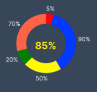
Make a new file name it anything we'll go with CustomPie.js define your function or class whatever you prefer at this point and now we need to define our dataSource, Victory Pie takes it's array of objects in specific key-value pairs of x and y where x is value of label and y is weight of that value/label.
graphicData: [{ y: 10, x: '5%'},{ y: 90, x: '90%'},{ y: 50, x: '50%'},{ y: 20, x: '20%'},{ y: 70, x: '70%'},],
in your return statement:
<VictoryPiedata={this.state.graphicData}width={250}height={250}innerRadius={50}style={{labels: {fill: 'white', fontSize: 15, padding: 7,}, }}/>
You can customize label object with all the Text props in styles.
If you want to display some text between Pie, unfortunately library doesn't assist us with that but since pie is standalone we don't have to style it we can just add an absolute text above it and that'll do the trick.
<Text style={{position: 'absolute',top: 115,left:'50%',color: '#FFE600',}}> 85% </Text>

To add colors to our pie chart leaves we can pass a color array to it's props colorScale:
//in your state object define a state
graphicColor: ['red', 'blue', 'yellow', 'green', 'tomato']
...
//in your victoryPie component add this prop
colorScale={this.state.graphicColor}

Now we're gonna twitch it by passing different props and make different customized charts.
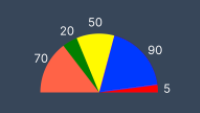
Starting by middle one at the top:

Now to make this we only need to pass 3 more props to our current VictoryPie component:
padAngle={5} //defines the padding between adjacent data slicesendAngle={-90} //where pie angel should endstartAngle={90} //where angel should start

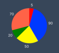
Now if we eliminate inner radius prop and padAngle prop, we can achieve upper figure.

By further eliminating startAngel and EndAngel we can get a whole classic pie like above.


You can play around with radius and other props to achieve whatever you want LITERALLY WHATEVER.
Go to their documentation for deep dive link.
I hope this helped all your Charts needs please comment down below if you liked it, don't forget to drop a clap and reach me out if you need any help.

Here's my Twitter not that it'll help you with any constructive information but here it is: Swair_AQ
